
 Deutsche Version
 Entire Gallery

 Next Picture
 Previous Picture
Final Signs
Posted: 14 December 2009
| Taken: | 2009-12-14 23:24:43 |
|---|---|
| Camera: | Canon EOS 1000D |
| Exposure: | -1/1 |
| ISO: | 200 |
| Aperture: | f/5.6 |
| Exposure Time: | 1/50 |
| Focal Length: | 34 mm |

This work is licensed under a Creative Commons Germany license.
Notes
Here something for the combined railroad fans and typography/signage nerds of DA, a group that on a good day includes… me. Hey, there’s a reason I’m not posting it over at [The Railfan Nation][trn]. Aside: If you are a railroad fan, please do take a look, it’s a group for all of us on [deviantART][da] and we can use every person who wants in.
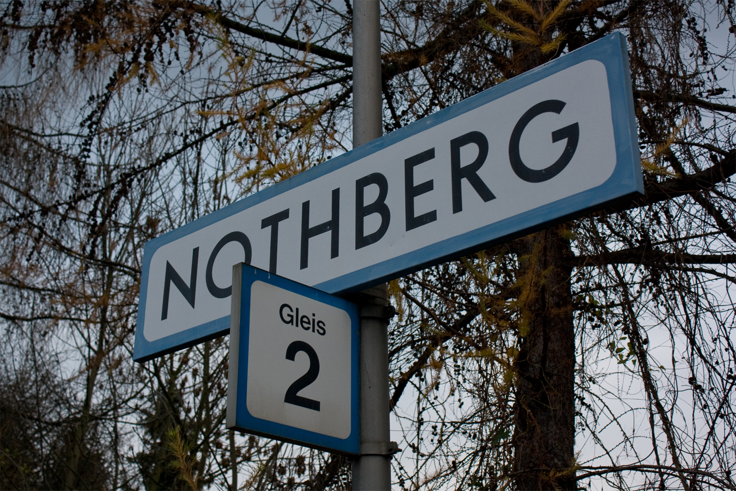
Now, back to the issue at hand. Before the white-on-blue signs that are common today, there were two previous generations of signs used on western german railroad stations that you can still find. The newer one was using Helvetica on a white background with a blue border with rounded edges. The “Gleis 2” (Track 2) sign is a typical example of that. Earlier, though, a font resembling Futura was used on a plain white background. The “Nothberg” sign (yes, this is in Nothberg again, the station that was closed this saturday) is an example of that, but someone added the newer blue border by hand. This means that already in the 1980s, I guess, Nothberg station was no longer deemed important enough for even something as simple as new, modern station name signs. As such, it was the final station between Aachen and Cologne to still use these signs. There are some incredibly huge letters in this style in Cologne, but no normal signs anymore (not counting signs only for rail personnel, the fonts for those are all over the place).
If you look at the font, you’ll quickly realize two things: First, that it looks like Futura, and second, that it isn’t Futura, even if german Wikipedia claims it is. Take a close look at the H, B, E which are symmetrical here, while the R is somewhat longer than standard Futura. There are other detail issues as well if you look long enough. I sure would like to know the story behind this font. According to some sources, a “pointy” and in my opinion somewhat Futura-y font was used for locomotive signs since 1938, but that’s as far as I got.